Saturday, February 22, 2014

Zoya Monet

So in the mail today I got something neat. My Zoya Monet bottle, along with Zoya Dillon and Rebel. They are amazing. But this post is focusing on Monet.


I got Monet for free because of the promo code I got in an email, because I did the 3 free promo. Hooray for promo chains! Monet is a glittery top coat with multicolored iridescent hex glitters. The glitters seem to be yellow, pink, and blue/green. But they look different on different base colors as they are somewhat sheer glitters. Because a friend was curious I wound up swatching it over various dark or bold colors, and not over Dillon or Rebel despite the fact that Rebel, Dillon and Monet all came together. However one of the colors I did use was Zoya's Wednesday which is almost a creme version of Dillon. I mean look at them side by side!

Dillon on the left and Wednesday on the right.

Scarily similar, but definitely not the same.. Anyway, I tried Monet on five different colors, one on each fingernail of my left hand. Here they are before Monet:


I didn't clean up right away because I wanted to wait until I had Monet on. Polishes are as follows:
Index: Zoya, Wednesday
Middle: Zoya, Lael
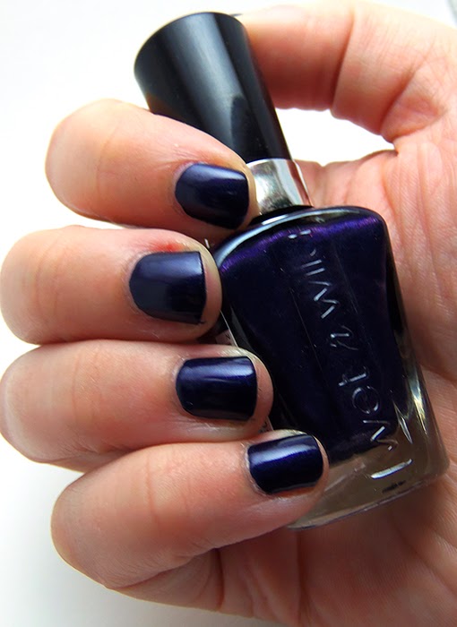
Ring: Wet-n-Wild MegaLast, Toxic Apple
Pinky: Wet-n-WIld Wild Shine, Burgundy Frost
Thumb: FingerPaints, Vintage Glam


Now after I put on Monet I kinda fell in love with it's looks but also rather dislike the formula. The glitter are suspended in a very thick and kinda gloppy sheer pink jelly base. While the thickness helps suspend the glitter so it doesn't all sink and you get plenty of glitter on the brush but, it's kind of odd to work with. I may get used to it but for now I'm not a fan of the formula. While the base is pink it applies sheer enough to not see the pink at all, or dull down your base color. the glitters are very sparkly as glitter should be and they distribute pretty evenly but will occasionally clump, which in a way means the thick formula helps give you time to spread more evenly, so there is a plus. The glitters are very good at catching light even on very dark colors. Here is photographic proof:


Honestly? I like it much more over dark colors, because it really pops. And for bonus points here is a video! Pardon the fact that I took it before I cleaned up.


Over all I love Monet, it's very pretty and unique in my collection. I would recommend it to anyone who has a hunger for glitter and pretty colors. Really the only con, and I'm not sure it really is a con, is the thick base. If you get past that, it's all bling and beauty.

Anyone else get Monet? How do you like it?

Sunday, February 16, 2014

First of all some of those pictures I promised from my internet break!

Here I have some OPI swatches I did during the week of boredom.

First of all I have OPI Incognito in Sausalito, from the Fall 2013 San Fransisco collection. This polish is a very, very dark navy blue. When I wear it half of the time my family mistakes if for a black. I personally love it for it's deep color. It's what I imagine deep oceans would look like from the ocean floor looking up. I used two coats and Seche Vite for the following picture, also pardon the damage to my fingertips I was a bundle of nerves and was thus chewing a lot.


The next color I have is OPI Teal The Cows Come Home, from the brights collection. I cannot get over how much  love this color. It is a beautiful shimmery light blue that honestly reminds me of the pool at my grandmother's home in San Diego. This is two coats with Seche Vite on top. My camera made the color appear a bit brighter than it should be but it is still a very up-beat blue.


Next we have OPI Purple with a Purpose, also from the brights collection. Everytime I get this polish out I have a small laugh when I inevitably blurt out "Poiple with a Poipose," I never claimed to be mature.... Anyway, this color, to me seems like a purple version of Teal the Cows Come Home. This is a very bright, and very friendly purple that is perfect for spring and summer. I applied two coats and Seche Vite. Again the picture turned out a bit bright.


And my final OPI swatch is OPI Muir, Muir On the Wall from the San Fransisco collection. This is a gorgeous duo-chrome shimmer that has a subtle plumb-burgundy to a dark copper shift. I love this color but it needs a bit of dedication to get it perfect. If you apply a heavy coat it will show brush stroke lines, if you apply a light coat it is very sheer, so I apply two or three thin cots to avoid the greater evil. The brush stroke lines. Pictured I used 2 coats with Seche Vite to top it off.


As a footnote, this color is most likely named for John Muir who was a great guy and deserves plenty of respect and is 100% worth learning about.

So that's all of them, the four OPI polishes I had at the time. I now have eight plus three shatters. Will get pictures of the rest of them someday.

So which of these colors do you think is your favorite?

Infinite apologies....

The world has kind of.... taken me by surprise. I got into another hobby.... shame on meee!

Gonna queue some posts tonight though. Sorry times a million for poofing.

Monday, February 3, 2014

I RETURN! Barely survived....

So back on the internet I am. And being offline for a week nearly killed me due to boredom, I started strong with entertaining myself with painting my nails, then I started sleeping a lot... and then I just went crazy and had to leave the house for a bit lest I go totally coo-coo. But here I am back again. With lots of pictures. I'll stagger the posts, and not throw them all at you at once. Well start with some swatches and then go into some other stuff, but for now I just want to say, I'm happy to be online again!

See you guys in a bit!

Tuesday, January 21, 2014

Zoya Freebie Haul!

From Zoya's promotion get three polishes free if you pay 12 in shipping. I got the colors Chantal, Lael, and Wednesday. I'm excited to try them on my hands but at the moment I have a boo-boo on my index finger on my right hand which is the easiest hand to paint for me. Yay being a leftie and finger chewer. Anyway, here is my "unboxing" photos and then swatched on nail sticks.


When I saw this package in the mail box I danced back up the drive way.


Cute box that it was shipped in.

The bottles were pretty dusty inside box, but I'm used to dust.


The bottoms of the bottles showing their names.
The glass looks foggy because they were in my mail box all day and the cold cause some condensation when they came inside.
 
This is Zoya's Wednesday
This is Zoya's Lael


And finally Zoya's Chantal


I really, really like Lael. I got Chantal because I needed a nude color. And Wednesday is a lovely sort of pale sea foam, not sure how it will look on me but it'll be nice to have anyway.

Anyway when I get these painted on expect more pictures, but starting Friday I am taking a vacation form the internet prescribed by my psychiatrist. She thinks I may have an internet/video game/electronics addiction that is interfering with me getting goals done (such as getting my license). So, we'll see how that goes. I'll have lots of pictures to share after my "vacation" I think. xD

Monday, January 20, 2014

SinfulColors Gorgeous

SinfulColors Gorgeous really is gorgeous.

It's a frosty bright blue, that requires 2 coats for full opacity. It applies very evenly but is a bit sheer in one coat. My bottle happened to have a somewhat deformed brush, but it is still usable, and is not a usual occurrence. When you are applying be sure to use even straight stroked and make your coats fairly thin because it may show brush lines if applied to heavily.

First two photos are of the deformed brush:


As you can see it is wide and flat because of the bristles breaking out the side of the stick. This is not normal, and the only time I have ever run into this issue in any polish.

And this is what the bottle looks like, in the bottle it looks darker than it really is.


And here it is applied, two coats, and a quick dry top coat.


I plan to buy this again when I see it again so I can have plenty and not worry about running out.

Wet-N-Wild Toxic Apple

Blurple! Blurple is my new favorite word! It also describes Wet-N-Wild's Toxic Apple polish. It's from the Mega Last Pick Your Poison collection, which I first saw last year (2013) but has been in rotation every fall for a while, with a few different colors in the mix each time from what I gather.

Anyway, I got this just before Halloween and have not done a full paint job with it before. So here I am putting it on today and I decided to do a quick post/review/whatchamacallit about it. Here we go.

First of all in the bottle it looks very purple. Here is some photographic proof of that:


But as you apply it you will see there is a LOT of blue in there. My pictures really don't do justice to how beautifully blurple this polish is.


It is also very shimmery, which my photos also don't show very well. 

Applying the polish was a breeze, two coats are needed for full opacity, any more than that would just be over kill and not add much effect for the effort. The polish it's self is a teensy bit watery but definitely workable.

The brush on the Mega Last polish bottles are pretty great for a cheaper polish brand. I love how they cover a wider area and are rounded slightly so when you get to the "corners" of your nails and cuticles you are less likely to make a mess of yourself while painting.

Anyway, thaty's my 2 cents on my first blurple polish.

Also as a bonus for you guys, I want you all to meet Ivy who decided she needed to help me take pictures of the polish's bottle.


Such a little helper. She's a new addition to the family and is totally adorable and is enjoying getting into EVERYTHING. Ahh kittens..... Try painting your nails with a mewling fluff bucket on your shoulder, table, lap, head.... everywhere.

Anyway, good morning! What is everyone doing today?